The dark mode is a big welcome!
However, the color scheme is a bit too dark / high contrast in my opinion.
Could we make the main black background a bit lighter, so the text is not white on black?
The dark mode is a big welcome!
However, the color scheme is a bit too dark / high contrast in my opinion.
Could we make the main black background a bit lighter, so the text is not white on black?

The dark theme primary background and text colors are already dark gray (#111212) and light gray (#e4e5e5) as opposed to pure white and black. This means that the contrast ratio is just a little under 15:1 as opposed to the 21:1 you'd get with white and black/
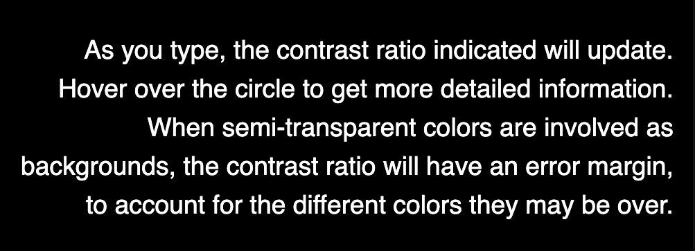
Here's an animated gif to illustrate the difference.
I don't want to drop these much more because sometimes "lighter" text and "darker" backgrounds are used, and we don't want contrast to get too low for accessibility reasons. This is a bit trickier in dark themes which need to be lower contrast to start with.
If the overall brightness is still too high for you in your current ambient light I might try lowering your screen brightness as needed.

I see. I would still go a bit lighter on the black. I think there should be an algorithm to decide when to change the text color so that readability is preserved, in cases of low contrast.
Currently, to the naked eye, there is no real apparent difference between the top black bar and the text background in the body of the page. This also makes things a bit awkward in terms of navigation for new users.
Overall, it still feels a bit harsh on the eyes, compared to other dark themes.